Get the Right Tile Without Getting Ripped Off
When it comes to home renovation, tiles are often the biggest expense – and one of the easiest places to make costly mistakes. With so many options on the market, it's easy to get distracted by good looks and low prices, only to regret it later when tiles stain easily, feel slippery, or simply don't look right.
Here's a straightforward guide to help you make smart, practical choices – and get the best value for your money.
Step 1: Match Tiles to Your Space
Don't start by asking "which tile is best?" – start by asking where it's going.
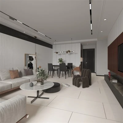
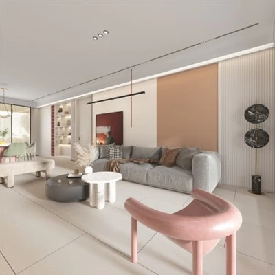
Living room / dining room – These are the most visible and most used areas of your home. Choose polished sintered stone or full-body marble-look porcelain tiles. They're hard, wear-resistant, and their reflective surface boosts brightness. For a spacious look with fewer grout lines, go with 750×1500mm or 900×1800mm formats.
Kitchen / bathroom – Here, anti-slip and easy cleaning are the top priorities. Floors must have a matte or satin anti-slip finish with a friction coefficient of at least 0.5. Walls can be glossy glazed tiles – grease wipes right off.
Balcony / patio – Use fully vitrified tiles with a water absorption rate below 0.5%. In colder climates, check for freeze-thaw resistance to avoid winter cracking.
Step 2: Use Simple Tests to Filter Out Poor Quality
Don't just trust the sales pitch – test the tiles yourself with these three quick checks.
Flatness – Place two tiles face-to-face and check the gap. The smaller and more uniform the gap, the better the flatness. If the edges curl or the centre lifts, you'll likely end up with uneven flooring or hollow spots.
Tap test – Knock gently on the centre of the tile with your knuckle. A clear, metallic ring means high density and good vitrification. A dull, hollow sound suggests a porous body – not suitable for floors.
Water drop test – Flip the tile and pour a few drops of water on the back. If the water soaks in quickly, the tile has high absorption – never use this on floors. It's only for walls and will absorb stains and odours over time.
Step 3: Avoid Pattern Pitfalls – Keep It Simple
Veining – Look for continuous or seamless patterns. Avoid tiles with isolated, overly dramatic markings – they'll look disjointed once installed. The overall visual flow matters far more than how a single tile looks in the showroom.
Colour – For smaller homes, choose light tones – pale grey, cream, oat milk. They make rooms feel larger and brighter. Dark tiles are best reserved for spacious, well-lit apartments or villas.
Final Word
Brand prestige comes at a cost – but physical performance is non-negotiable. Focus on purpose, density, and simplicity. Do that, and you'll nail your tile selection, avoid expensive mistakes, and spend your budget exactly where it counts.